


The feel of the text does not match the subject of the image.


The feel of the text does not match the subject of the image.
I wanted to go with a florescent neon sign kinda look but I do agree. Really though, I am apprehensive about changing the actual lettering anymore since I've spent at least four hours total on just the text. The only thing I'm willing to change now is color, size, and placement of the text.Originally Posted by gwahir

I need to force myself to learn Illustrator.
You guys have been great. Here's an updated version.
edit: I think I should make "Lil wayne" a little less glowy.
Last edited by KT.; 01-14-2009 at 01:10 AM.
 Posting Permissions

 Reply With Quote
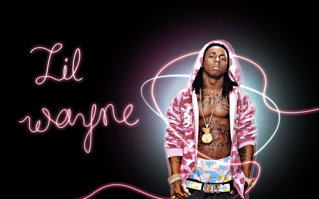
Bookmarks